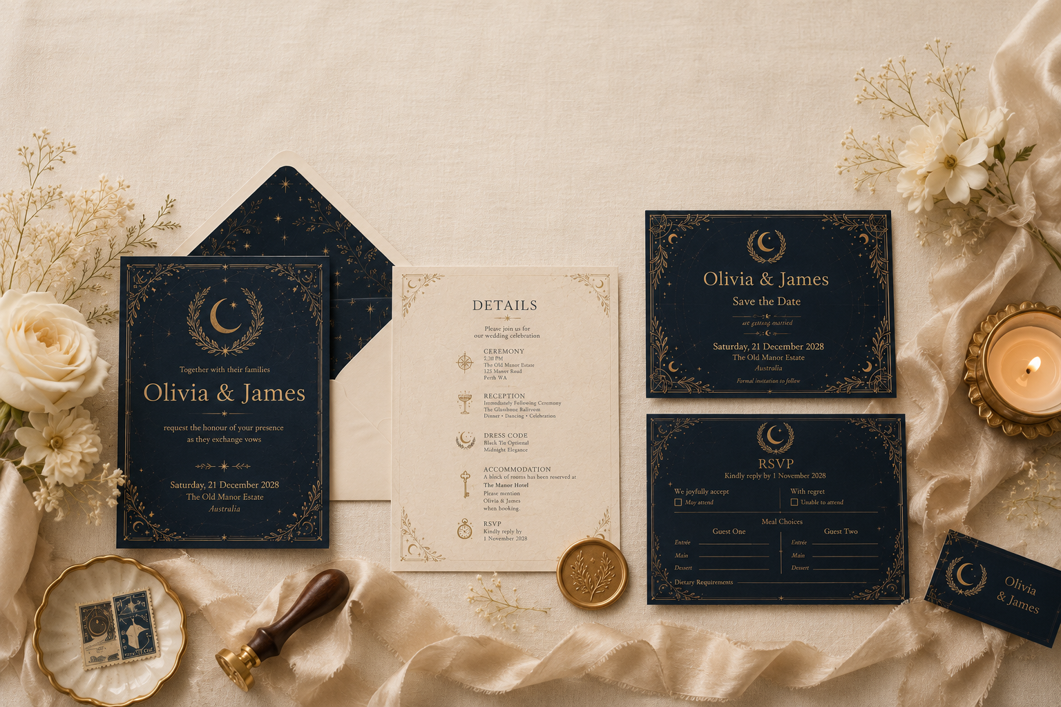
The Art of the Invitation
A monthly editorial publication from Written in Starlight celebrating timeless wedding stationery, thoughtful design, and beautifully considered celebrations.
Welcome
There is a moment before every wedding that often goes unnoticed.
It arrives quietly.
Long before the first guest takes their seat, before the champagne is poured, before music fills the air and vows are exchanged beneath open skies.
It begins with an envelope.
Carefully addressed.
Thoughtfully opened.
Held between expectant hands.
Within it lies more than an invitation. It carries anticipation, emotion and possibility. It offers the very first glimpse of a celebration still waiting to unfold.
That single moment sets the tone for everything that follows.
Welcome to the inaugural edition of The Twilight Journal.
Each month, we’ll explore the artistry behind luxury wedding stationery through beautifully curated inspiration, thoughtful guidance and timeless design principles. Rather than chasing fleeting trends, our aim is to celebrate stationery that feels enduring—pieces designed not only for one unforgettable day, but as keepsakes to be treasured for years to come.
Whether you’re planning your wedding, gathering inspiration for the future, or simply appreciate beautiful paper and considered design, we’re delighted you’ve joined us.
Pour yourself a cup of tea, settle into your favourite chair, and enjoy this month’s edition.
“Every unforgettable celebration begins with a beautifully told story. Long before the vows, that story begins with an invitation.”
Nicole – Written in Starlight
Editor’s Letter
There is something wonderfully romantic about paper.
In an age of digital calendars, instant messages and online RSVPs, receiving a beautifully crafted invitation still feels deeply personal. It asks us to slow down, to pause for a moment, and to imagine the celebration that awaits.
That sense of anticipation is exactly what inspired the creation of The Twilight Journal.
When I founded Written in Starlight, my vision extended beyond creating beautiful stationery. I wanted to create a place where couples could discover ideas, learn about thoughtful design, and feel inspired throughout every stage of their wedding journey.
Over the past few months, as our collections have grown, I’ve found myself wanting to share more than product launches. I wanted to share the stories behind the designs, the traditions that continue to shape modern weddings, and the small details that quietly transform an event into an unforgettable experience.
This journal is the beginning of that conversation.
Each monthly edition will explore a different aspect of luxury wedding stationery—from invitation etiquette and paper selection to colour palettes, emerging trends, and the craftsmanship that goes into creating a cohesive wedding suite.
You’ll also find behind-the-scenes glimpses into our studio, practical planning advice, seasonal inspiration and exclusive previews of new collections.
My hope is that The Twilight Journal becomes something you genuinely look forward to reading each month—a quiet moment of inspiration amidst the excitement of wedding planning.
Thank you for being here for our very first issue.
I’m so pleased to welcome you.
With warmest wishes,
Nicole
Founder & Designer
Written in Starlight
In This Issue
This month we’re exploring The Art of the Invitation.
Inside you’ll discover:
• Why luxury invitations leave a lasting impression.
• The often-overlooked details card—and why it may be the most important piece in your invitation suite.
• Behind the design of our signature Celestial Twilight Collection.
• Three thoughtful design principles that instantly elevate wedding stationery.
• Editorial inspiration for timeless celebrations beneath the stars.
• A look behind the scenes in the Written in Starlight studio.
This Month’s Theme
The Art of the Invitation
An invitation is far more than a date, a venue and a request to attend.
It is your guests’ first introduction to the atmosphere you’ve imagined.
It whispers whether your celebration will be intimate or grand, modern or timeless, formal or wonderfully relaxed.
The finest invitations don’t simply communicate information.
They invite people into a story.
And every remarkable story deserves a beautiful beginning.

“Luxury is rarely found in excess. It lives in thoughtful details, quiet confidence and timeless design.”
Nicole – Written in Starlight
Chapter One
Why Luxury Invitations Feel Different
The first impression your guests will never forget.

There is an unmistakable feeling that accompanies a beautifully crafted invitation.
It isn’t something easily measured.
It isn’t determined solely by thicker paper, elegant typography or luxurious finishes.
Instead, it is something quietly experienced.
The gentle weight of the cardstock.
The texture beneath your fingertips.
The way soft light catches antique gold detailing.
The careful composition of every line and every margin.
Before a single word has been read, an invitation has already begun telling its story.
Luxury stationery is rarely about extravagance.
Rather, it is about intention.
Every element exists because it contributes to the experience.
Nothing feels accidental.
Nothing competes for attention.
Instead, each decision works in harmony to create something that feels effortless.
That quiet confidence is what distinguishes timeless design from passing trends.
“The finest invitations don’t announce luxury. They simply allow guests to feel it.”
Nicole – Written in Starlight
More Than Information
Many couples begin planning their invitations by asking what information needs to be included.
The date.
The venue.
The dress code.
The RSVP deadline.
These details are certainly important.
But truly exceptional invitations achieve something far greater.
They create anticipation.
Imagine receiving an invitation for a candlelit estate wedding in late autumn.
Before you’ve even read the venue, the paper already feels substantial in your hands.
The typography is elegant without appearing ornate.
The colours are restrained.
The layout is spacious.
Without consciously realising it, you’ve already formed an impression of the celebration itself.
You begin imagining flickering candles, quiet conversation, champagne beneath chandeliers and an evening filled with timeless elegance.
None of these details were explicitly written.
Yet the invitation has already communicated them.
That is the remarkable power of thoughtful design.

Designing for Emotion
The most memorable weddings are remembered not because every detail was extravagant.
They are remembered because they made people feel something.
Invitations work in exactly the same way.
Rather than asking,
“How can I make this invitation more impressive?”
Luxury designers often ask,
“How do I want my guests to feel?”
Calm.
Welcomed.
Excited.
Curious.
Romantic.
Every design decision should support that emotional experience.
A sophisticated colour palette encourages calm.
Generous white space creates elegance.
High-quality paper communicates permanence.
Refined typography inspires confidence.
Together, these seemingly small decisions create an invitation that feels considered rather than decorated.
“Beautiful stationery isn’t created by adding more. It’s created by knowing what to leave out.”
Nicole – Written in Starlight
The Quiet Confidence of Simplicity
One of the greatest misconceptions surrounding luxury design is that it requires elaborate embellishment.
In reality, simplicity is often far more difficult to achieve.
It requires restraint.
Every flourish must justify its place.
Every decorative element should serve the overall composition rather than compete with it.
The world’s most enduring invitation suites often feature remarkably little:
Beautiful typography.
Exceptional paper.
Balanced spacing.
A restrained palette.
Subtle finishing details.
When these elements are thoughtfully combined, the result feels timeless.
Not because it follows current trends.
But because it transcends them.

Creating a Cohesive Story
An invitation is never experienced in isolation.
It is the opening chapter of an entire wedding story.
Guests continue encountering that story throughout the day.
Menus.
Place cards.
Welcome signage.
Seating charts.
Thank you cards.
Each piece becomes another page in the same narrative.
When these elements share consistent typography, colour, materials and design language, the entire celebration feels intentional.
Guests may never consciously recognise this consistency.
Yet they will remember how naturally every element belonged together.
That sense of cohesion quietly elevates the entire experience.
Investing in What Lasts
Flowers eventually fade.
Music drifts into memory.
The final slice of cake is enjoyed.
Yet invitations often remain.
Pressed inside keepsake boxes.
Tucked into family albums.
Displayed within framed wedding photographs.
Many couples discover years later that their invitation has become one of the few tangible reminders of their wedding day.
It becomes something their children will one day hold.
A small piece of family history.
Perhaps that is why thoughtful stationery continues to matter.
Not because it is fashionable.
But because it quietly becomes part of the memories we choose to preserve.
“Long after the celebration has ended, beautiful paper continues telling its story.”
From the Studio
When designing every Written in Starlight collection, I begin with a single question:
“What should this celebration feel like?”
The answer is never simply a colour palette.
Instead, it becomes an atmosphere.
For Celestial Twilight, that atmosphere was inspired by quiet evenings beneath an endless sky.
Warm candlelight.
Deep midnight blue.
Soft ivory.
Antique gold.
A celebration that feels intimate, elegant and timeless.
Every decision—from the spacing between lines of text to the warmth of the paper stock—was guided by that feeling.
Because beautiful invitations should never feel like products.
They should feel like the beginning of your story.
“The invitation is not simply the first piece of stationery your guests receive. It is the first promise your wedding makes.”
Chapter Two
The Quiet Hero of Every Invitation Suite
Why Every Wedding Needs a Beautifully Designed Details Card

There is a curious irony in wedding stationery.
The piece that often receives the least attention during the design process is frequently the one guests rely upon the most.
The Details Card.
It rarely becomes the centrepiece of an invitation suite.
It isn’t displayed on mantels or photographed quite as often as the invitation itself.
Yet it quietly answers every question that allows your celebration to unfold effortlessly.
Where should we park?
Is there transport?
What time should we arrive?
Can we bring children?
Where should we stay?
Rather than interrupting the beauty of the invitation with practical information, the Details Card allows elegance and functionality to exist side by side.
It is one of the smallest pieces within a suite.
And often one of the most thoughtful.
“Beautiful hospitality begins long before guests arrive. It begins with making them feel confidently prepared.”
Elegance Through Simplicity
One of the defining characteristics of luxury stationery is restraint.
The invitation itself should remain beautifully uncluttered.
Its purpose is simple.
To invite.
To set the tone.
To introduce the celebration.
When every logistical detail is squeezed onto a single card, something important is lost.
The typography becomes smaller.
White space disappears.
The invitation begins to resemble an itinerary rather than a keepsake.
Separating practical information into a dedicated Details Card allows each piece within the suite to perform its role beautifully.
The invitation creates emotion.
The Details Card creates confidence.
Together they create a seamless guest experience.

What Should a Details Card Include?
Every wedding is unique, but most beautifully designed Details Cards include a selection of practical information presented with clarity and intention.
Rather than overwhelming guests with lengthy paragraphs, organise information into simple, elegant sections.
You might choose to include:
Accommodation
Recommend nearby hotels or accommodation options for travelling guests.
Where appropriate, include booking codes or reservation deadlines.
Transportation
Provide shuttle schedules, parking information or nearby public transport.
Small details like these remove uncertainty before guests even leave home.
Dress Code
Rather than simply stating “Formal” or “Cocktail,” consider offering gentle guidance.
For example:
Black Tie Optional
or
Garden Formal — Please note the ceremony will take place on the lawn.
These subtle clarifications help guests feel comfortable and appropriately dressed.
Wedding Website
Rather than overcrowding the invitation itself, include your wedding website here.
This is an ideal place for:
• Online RSVPs
• Gift registry
• Travel recommendations
• Frequently asked questions
• Weekend itinerary
Children
If your celebration will be adults only, the Details Card provides a thoughtful place to communicate this gently.
Likewise, if children are warmly welcomed, mentioning it here offers reassurance to families.
Gift Preferences
Modern etiquette increasingly favours simple, gracious wording.
A short note directing guests toward your registry or wishing well is often all that is required.
Additional Information
Depending upon your celebration you might also include:
• Ceremony timing
• Reception timing
• Accessibility information
• Cultural traditions
• Weather considerations
• Mobile phone guidance
• Recovery brunch details
“Thoughtful design anticipates questions before they’re ever asked.”
The Beauty of White Space
Perhaps the greatest temptation when designing a Details Card is trying to include absolutely everything.
Luxury design teaches the opposite.
If your Details Card begins to feel crowded, your wedding website becomes your greatest ally.
Allow the printed card to provide only the most important information.
Then gently direct guests online for additional details.
This approach preserves both readability and elegance.
White space should never be viewed as empty.
It is breathing room.
It allows every word to carry greater significance.

Common Mistakes We See
Every invitation suite tells a story.
Unfortunately, a few common design choices can unintentionally interrupt that narrative.
Including Too Much Information
More information rarely creates a better experience.
Instead, prioritise what guests truly need.
Inconsistent Typography
Switching between multiple fonts or dramatically different styles can make a suite feel disconnected.
Consistency is one of the quiet hallmarks of luxury.
Forgetting the Guest Experience
Always imagine reading your Details Card for the very first time.
Can guests quickly locate the information they need?
If not, simplify.
Tiny Text
Elegance should never come at the expense of readability.
Choose type sizes that remain comfortable for guests of every age.
Ignoring Your Overall Suite
The Details Card should feel like part of the invitation—not an afterthought.
Matching paper, typography, colours and spacing create a seamless visual experience from beginning to end.
“Consistency transforms individual stationery pieces into a complete wedding story.”
Designer’s Notebook
One of my favourite moments during the design process is arranging an invitation suite together for the first time.
Invitation.
Details Card.
RSVP.
Envelope.
Ribbon.
Wax seal.
Each individual piece is beautiful on its own.
But together they create something entirely different.
They become a complete experience.
This is why I encourage couples to think beyond individual products.
Rather than selecting stationery one piece at a time, imagine the entire collection sitting together.
The result is quieter.
More cohesive.
More timeless.
Ultimately, more memorable.

Featured Collection
Celestial Twilight Details Card
Our Celestial Twilight Details Card was designed to complement the complete invitation suite while providing generous space for all the practical information your guests need.
Featuring soft ivory tones, elegant serif typography and refined spacing, it balances functionality with timeless design.
Whether you’re hosting an intimate garden celebration or a grand ballroom reception, it allows every guest to feel informed without compromising the beauty of your invitation.
Available as:
• Editable Canva Template
• Professionally customised digital design
• Printed luxury stationery through Written in Starlight
Discover matching invitations, RSVP cards, menus, place cards, seating charts and more—all designed to create a beautifully cohesive wedding day.
“The best-designed Details Cards are rarely noticed—and that’s precisely the point. Their quiet elegance allows every guest to simply enjoy the celebration.”
Chapter Three
Behind the Collection
Inside Celestial Twilight
A collection inspired by quiet evenings, timeless romance and the beauty of the night sky.

Every collection begins with a feeling.
Not a colour palette.
Not a font.
Not even a sketch.
Long before the first invitation is designed, there is an atmosphere waiting to be translated into paper.
For Celestial Twilight, that feeling arrived on a quiet winter evening.
The sky had settled into deep shades of blue, the last warmth of the sun lingering on the horizon while the first stars quietly appeared overhead. Candlelight glowed softly through nearby windows, and the world seemed to slow, if only for a moment.
There was an unmistakable sense of calm.
Of anticipation.
Of romance.
That fleeting moment became the foundation of everything that followed.
Rather than recreating the night sky literally, I wanted to capture how twilight feels—the peaceful transition between day and evening, where every detail seems softer, quieter and more intentional.
That atmosphere became Celestial Twilight.
“The most beautiful collections begin with emotion, not decoration.”
Designing an Atmosphere
Wedding stationery should do more than coordinate with a colour palette.
It should create anticipation.
When guests open an invitation suite, they begin imagining the celebration long before they arrive.
Will it be formal?
Relaxed?
Romantic?
Contemporary?
Traditional?
These impressions are often formed before a single word has been read.
The role of thoughtful design is to guide those emotions quietly, allowing guests to feel the atmosphere you’ve imagined.
For Celestial Twilight, every decision was made to reinforce one simple idea:
An elegant evening celebration beneath the stars.

The Palette
Colour has an extraordinary ability to evoke emotion.
Rather than selecting colours because they were fashionable, each shade within the collection was chosen for the feeling it creates.
Deep Midnight Navy
A colour that brings depth, sophistication and quiet confidence.
Rather than using black, the navy reflects the richness of the evening sky just after sunset.
It feels softer.
More romantic.
More timeless.
Warm Ivory
Luxury paper should never feel stark.
The soft ivory tones throughout the collection introduce warmth while allowing the typography to remain beautifully legible.
It recalls antique paper, handwritten letters and heirloom keepsakes.
Antique Gold
Rather than bright metallic gold, antique gold offers understated elegance.
It catches the light gently.
Never overpowering.
Always complementary.
Its warmth echoes candlelight, creating subtle richness throughout the suite.
Soft Charcoal
Used throughout the typography, charcoal provides greater softness than pure black while maintaining exceptional readability.
It allows the page to breathe.
“Luxury palettes whisper. They never shout.”
The Language of White Space
One of the defining characteristics of the Celestial Twilight Collection is not what has been added.
It is what has been intentionally left empty.
White space is often misunderstood.
Many assume unused space is unfinished.
In reality, generous margins are one of the oldest principles of editorial design.
Space allows every element to breathe.
It creates rhythm across the page.
It guides the reader naturally from one detail to the next.
Most importantly, it gives every word greater significance.
Luxury rarely feels crowded.
It feels composed.
Typography That Endures
Typography is the voice of stationery.
Some fonts feel playful.
Others feel dramatic.
Some follow current trends only to quickly feel dated.
For Celestial Twilight, I searched for typography that would still feel elegant decades from now.
Classic serif letterforms create a sense of permanence.
Balanced spacing encourages calm.
Restrained hierarchy ensures every line feels intentional.
The goal was never to impress.
The goal was to endure.
Because wedding invitations should remain beautiful long after trends have passed.
Every Piece Belongs Together
Perhaps the most satisfying part of designing a collection is watching each individual piece gradually come together.
The invitation introduces the celebration.
The RSVP continues the conversation.
The Details Card quietly informs.
Menus welcome guests to the reception.
Place cards guide them to their seats.
Seating charts become part of the décor.
Thank-you cards offer the final chapter.
Each piece serves a different purpose.
Yet each speaks the same visual language.
This consistency creates a wedding experience that feels thoughtful from beginning to end.
Guests may never consciously notice every design choice.
They will simply remember how beautifully everything belonged together.
“The finest stationery collections feel less like individual products and more like chapters within the same story.”
Designed for Modern Couples
Although inspired by timeless design, Celestial Twilight was created with modern celebrations in mind.
Every template is fully editable, allowing couples to personalise wording while preserving the overall aesthetic.
Whether you’re hosting a formal ballroom reception, a private estate celebration or an intimate garden wedding beneath the evening sky, the collection is designed to adapt beautifully.
This flexibility reflects something I value deeply within Written in Starlight.
Luxury should never feel inaccessible.
Beautiful design should be both refined and personal.
From the Studio
When I’m designing a new collection, I often imagine a single guest opening the envelope for the first time.
They pause.
They smile.
Perhaps they run their fingertips gently across the paper.
Perhaps they place it somewhere safe rather than setting it aside.
That small moment matters.
Because if an invitation can make someone pause for just a little longer than expected, it has already begun creating the experience of the wedding itself.
That is always the goal.
Not simply beautiful paper.
But meaningful moments.

Collection Spotlight
The Celestial Twilight Suite Includes
- Save the Date
- Wedding Invitation
- RSVP Card
- Details Card
- Menu
- Place Card
- Table Number
- Seating Chart
- Welcome Sign
- Thank You Card
- Vow Book
- Matching Day-of Stationery
Each piece has been thoughtfully designed to create a cohesive visual experience from the moment guests receive their invitation until long after the celebration has ended.
“A truly timeless collection doesn’t follow trends. It quietly outlives them.”
Chapter Four
The Designer’s Notebook
Five Quiet Details That Instantly Elevate Wedding Stationery
Luxury is rarely created by a single dramatic feature. More often, it emerges through a collection of thoughtful decisions—small details that work together so seamlessly they appear effortless.

When people speak about luxury wedding stationery, they often imagine foil stamping, letterpress printing or elaborate embellishments.
While these finishing techniques certainly have their place, they are not what make stationery feel luxurious.
The truth is much quieter.
Luxury lives in restraint.
It lives in craftsmanship.
It lives in the hundreds of tiny decisions that most people never consciously notice—but instinctively appreciate.
As a designer, these are the details I return to with every collection.
“The difference between beautiful and unforgettable is often found in the details no one can quite explain.”
01
Paper Comes First
Before colour.
Before typography.
Before ribbons or wax seals.
The paper is the foundation of everything.
A beautifully designed invitation printed on poor-quality stock immediately loses much of its impact.
Conversely, even the simplest design can feel extraordinary when printed on carefully selected paper.
Paper changes the experience before a guest has even begun reading.
Its weight communicates quality.
Its texture invites touch.
Its finish influences how colours appear and how light interacts with the page.
Whenever possible, choose paper that encourages guests to pause.
Luxury invitations are meant to be held—not hurriedly opened and discarded.

02
Give Every Word Room to Breathe
One of the greatest luxuries in editorial design is space.
Not empty space.
Intentional space.
Margins.
Line spacing.
Balanced proportions.
Thoughtful alignment.
These quiet design decisions allow information to feel calm rather than overwhelming.
It’s tempting to include every possible detail on the invitation itself.
Yet removing unnecessary information often creates a more elegant result.
The eye naturally appreciates order.
Luxury design understands this instinct.
Rather than filling every corner, it allows each element the space it deserves.
“White space is not something left over. It is an essential design element in its own right.”
03
Consistency Creates Confidence
Guests rarely remember individual design choices.
Instead, they remember the overall feeling.
That feeling comes from consistency.
Matching typography.
Coordinated colours.
Balanced layouts.
Repeating visual elements throughout every piece.
Invitation.
RSVP.
Details Card.
Menus.
Place cards.
Signage.
Thank-you cards.
When each item speaks the same visual language, your celebration feels carefully curated rather than assembled.
It creates an experience that unfolds naturally from beginning to end.
04
Less Decoration. More Intention.
One of the most common misconceptions about luxury design is that more decoration equals greater elegance.
In practice, the opposite is often true.
Every decorative element should have a purpose.
A silk ribbon draws attention to the invitation.
A wax seal creates anticipation before the envelope is opened.
An envelope liner introduces colour before the invitation is revealed.
Nothing exists purely to fill space.
When every detail serves a purpose, the final design feels composed rather than embellished.
Restraint allows craftsmanship to become the focal point.

05
Design for Memory
Perhaps the most important question I ask while designing isn’t:
“Does this look beautiful?”
Instead, I ask:
“Will someone want to keep this?”
Wedding invitations occupy a unique place in our lives.
Unlike everyday correspondence, they often become treasured keepsakes.
Pressed into albums.
Stored in memory boxes.
Displayed alongside wedding photographs.
Passed down through generations.
Designing for permanence changes every decision.
It encourages simplicity over trend.
Craftsmanship over novelty.
Timelessness over fashion.
Because beautiful stationery should still feel beautiful many anniversaries from now.
“A wedding invitation isn’t designed for one day. It’s designed for the memories that follow.”
Beyond the Invitation
The principles of thoughtful design extend far beyond stationery.
The same philosophy influences every carefully planned wedding.
The choice of candlelight over harsh lighting.
Natural linen instead of synthetic fabrics.
Fresh florals chosen for seasonality.
Music that reflects the couple rather than current trends.
Luxury is never created by one spectacular feature.
It is created through consistency.
Through intention.
Through countless thoughtful decisions working quietly together.
Stationery simply happens to be where that experience begins.

Designer’s Reflection
One of my favourite moments happens after a wedding has finished.
Occasionally, a couple will send me a photograph of their invitation framed beside their wedding portrait.
Years later, they still display it.
Not because it was expensive.
Not because it followed the latest trend.
But because it reminds them of the beginning.
Of anticipation.
Of the excitement they felt while preparing for one of the most meaningful days of their lives.
Moments like these remind me why thoughtful stationery continues to matter.
Not simply because it is beautiful.
Because it becomes part of a family’s story.
“The most luxurious invitations are not the most elaborate. They are the ones that still feel beautiful twenty years later.”
Editor’s Recommendation
If you’re beginning your own stationery journey, start with one simple question:
How do you want your wedding to feel?
Not what colours are trending.
Not what everyone else is choosing.
Simply the feeling you hope your guests carry with them from the moment they open your invitation until the final dance of the evening.
Every design decision becomes clearer from there.
Studio Suggestion
If you’re unsure where to begin, explore one of our curated stationery collections or enquire about a bespoke design. Whether you personalise one of our editable templates or commission a completely custom suite, every collection at Written in Starlight is designed with the same philosophy:
Timeless elegance.
Thoughtful craftsmanship.
Beautiful stories, told on paper.
Chapter Five
The Inspiration Gallery
This Month’s Mood
Twilight Romance
Every collection begins with inspiration. Every celebration begins with a feeling.

Great design rarely begins with a colour palette.
It begins with a moment.
Perhaps it’s the quiet stillness of an evening garden.
The warmth of candlelight dancing across linen.
The scent of fresh jasmine carried on the breeze.
Or the feeling of looking upward just as the first stars begin to appear.
These moments become the emotional foundation of a celebration.
This month’s gallery is inspired by those fleeting transitions—the gentle beauty of twilight, where daylight softly gives way to evening and every detail seems touched by quiet elegance.
Rather than recreating these scenes exactly, allow them to guide your choices.
Luxury weddings are rarely built from copying individual images.
Instead, they emerge from capturing a feeling.
“Inspiration isn’t something to imitate. It’s something to interpret.”
A Palette Inspired by Twilight
When selecting colours, consider how they make a space feel rather than simply how they appear together.
For this month’s inspiration, imagine standing beneath the evening sky just after sunset.
The light has softened.
The air feels cooler.
Candles begin to glow.
Everything appears slightly quieter.
Our August palette draws directly from this atmosphere.
Deep Midnight Navy
Sophisticated.
Grounding.
Timeless.
Like the sky moments after sunset, it provides depth without feeling harsh.
Warm Ivory
Soft and welcoming.
A colour that reflects candlelight beautifully while allowing every other element to shine.
Antique Gold
Rich without excess.
Warm rather than brilliant.
It introduces subtle luxury through quiet highlights rather than dramatic contrast.
Champagne
A gentle neutral that bridges ivory and gold while adding softness throughout the celebration.
Fresh White Florals
Classic.
Elegant.
Never competing with the surrounding palette.
White flowers allow texture and shape to become the focus.

Styling with Intention
One of the easiest ways to elevate a wedding is to stop thinking about individual decorations.
Instead, think about atmosphere.
Ask yourself:
How should the room feel when guests first enter?
Warm?
Romantic?
Elegant?
Relaxed?
Every styling decision should contribute to that answer.
A single candle may seem insignificant.
Dozens create ambience.
One ribbon feels decorative.
Repeated throughout the stationery, bouquets and table settings, it becomes a signature detail.
Luxury comes from thoughtful repetition.
“The most memorable celebrations aren’t filled with beautiful things. They’re filled with beautiful consistency.”
Textures That Tell a Story
True luxury is rarely visual alone.
It is experienced through touch.
The gentle texture of handmade paper.
The softness of silk ribbon.
The cool weight of a wax seal.
Natural linen beneath fingertips.
Pressed cotton paper.
These tactile elements invite guests to slow down.
They encourage interaction rather than observation.
Texture transforms stationery from something merely seen into something genuinely experienced.

The Language of Candlelight
Few design elements influence atmosphere as profoundly as lighting.
Candlelight softens colours.
It warms ivory paper.
It catches metallic details.
It creates gentle shadows that add depth and intimacy.
Whether your celebration features hundreds of candles or only a handful, their presence changes the emotional experience of a space.
This is why candlelight appears so frequently throughout the Celestial Twilight Collection.
Not as decoration.
As atmosphere.
Floral Inspiration

For this month’s gallery, simplicity remains the guiding principle.
Rather than oversized arrangements, choose flowers that feel timeless.
White garden roses.
Cosmos.
Ranunculus.
Sweet peas.
Lisianthus.
Jasmine vines.
Delicate foliage.
Allow flowers to complement the stationery rather than compete with it.
Elegant florals frame a celebration.
They should never overwhelm it.
“Flowers should feel gathered, not arranged.”
The Reception Table
Perhaps nowhere is consistency more visible than at the reception.
Menus.
Place cards.
Table numbers.
Candles.
Florals.
Glassware.
Linens.
Each element contributes quietly to a single visual story.
When designed together, these individual pieces disappear into the overall experience.
Guests rarely notice every detail individually.
Instead, they remember how effortlessly everything belonged together.
That quiet cohesion is one of the defining characteristics of luxury celebrations.

Curating Your Own Inspiration
Pinterest can be an extraordinary planning tool.
Yet it can also become overwhelming.
Instead of saving hundreds of unrelated images, curate with intention.
Create one board for:
Atmosphere.
One for:
Stationery.
One for:
Reception styling.
One for:
Flowers.
One for:
Fashion.
As your boards begin to grow, patterns will naturally emerge.
You’ll notice repeated colours.
Repeated textures.
Repeated lighting.
Repeated emotions.
Those patterns reveal your personal style far more accurately than any trend forecast.
Editor’s Tip
When saving inspiration, ask yourself one question before clicking “Save”:
“What feeling does this image create?”
If you can’t answer that question, it may not belong on your inspiration board.
Beautiful weddings are designed around emotions—not individual photographs.
“The goal isn’t to recreate someone else’s wedding. It’s to discover what makes yours unmistakably yours.”
Studio Mood Board
August Inspiration
This month our studio walls are filled with:
• Handmade cotton paper
• Silk ribbon in warm ivory
• Antique brass styling tools
• Midnight blue velvet
• White cosmos
• Garden roses
• Soft candlelight
• Linen textures
• Vintage astronomy illustrations
• Handwritten calligraphy
These elements continue inspiring new additions to the Written in Starlight collections and remind us that timeless design is built through thoughtful observation rather than fleeting trends.

Bring the Inspiration Home
If this month’s mood resonates with your vision, begin by choosing one element rather than attempting to recreate everything.
Perhaps it’s the colour palette.
Perhaps it’s the typography.
Perhaps it’s simply the warmth of candlelight reflected across ivory paper.
Small, intentional decisions create the most memorable celebrations.
Luxury is never achieved all at once.
It is built detail by detail.
“The most beautiful weddings don’t begin with a checklist. They begin with a feeling.”
Chapter Six
From the Studio
A Letter from the Design Desk
Every invitation begins long before the computer is switched on. It begins with observation, curiosity and the quiet moments that often pass unnoticed.

There is a common misconception that design begins on a screen.
For me, it almost never does.
Long before a collection takes shape, I spend time gathering moments rather than materials.
A particular shade of evening light.
The way linen folds naturally across a table.
The texture of handmade paper.
The colours hidden within old botanical illustrations.
The quiet elegance of a handwritten letter discovered inside a vintage book.
None of these moments seem particularly significant on their own.
Yet together, they slowly begin forming the foundations of a collection.
Design isn’t always about creating something entirely new.
Often, it’s about noticing beauty that has always been there.
“Inspiration is rarely found while searching for it. More often, it quietly introduces itself.”
Inside the Written in Starlight Studio
People often imagine a stationery studio filled with printers, ribbons and stacks of invitations.
While those things certainly exist, the heart of the studio looks rather different.
You’ll find books on typography sitting beside botanical reference guides.
Sketchbooks filled with unfinished ideas.
Swatches of linen collected from fabric stores.
Paper samples arranged beneath changing natural light.
Pressed flowers tucked inside notebooks.
Vintage astronomy illustrations pinned beside colour palettes.
Every object has found its place because it tells part of a story.
The studio isn’t simply where invitations are created.
It’s where collections are slowly discovered.

The Ritual Before Every Collection
Before I begin designing, I ask myself a single question.
“How should this collection feel?”
Not…
What colours should I use?
Or…
Which fonts are popular this year?
Instead, I begin with atmosphere.
Should it feel romantic?
Quiet?
Historic?
Modern?
Playful?
Once that feeling becomes clear, every other decision begins falling naturally into place.
Colours become easier to choose.
Typography becomes more intuitive.
Layouts become more restrained.
The collection begins revealing itself.
This process is slower than following trends.
But it creates work that feels more timeless.
“Beautiful design doesn’t begin with decoration. It begins with intention.”
A Collection Takes Shape
Every Written in Starlight collection follows a remarkably similar journey.
It begins with inspiration.
Then sketches.
Then countless tiny adjustments.
Margins become a little wider.
Typography moves a few millimetres.
Colours soften.
Spacing becomes quieter.
Occasionally, entire pages are redesigned from the beginning because something simply doesn’t feel right.
These refinements are rarely dramatic.
In fact, most visitors would struggle to notice them.
Yet collectively they create something entirely different.
Design is often less about knowing what to add.
More about recognising what should be removed.
Why We Refine
One of the questions I’m asked most frequently is:
“How long does it take to design an invitation?”
The truthful answer is…
Longer than most people imagine.
Not because drawing a border takes hours.
Or because selecting fonts is especially difficult.
Rather, it’s because refinement takes patience.
Every invitation should feel balanced.
Every paragraph should sit comfortably upon the page.
Every line should contribute to the overall composition.
Good design asks whether something works.
Great design asks whether it still works after everything unnecessary has been removed.
Beyond the Product
At Written in Starlight, I’ve never wanted to create stationery that simply fills a practical need.
My hope has always been to create pieces that become part of a couple’s memories.
The invitation displayed in a frame after the wedding.
The menu pressed inside a keepsake box.
The thank-you card tucked into a family album.
These are the objects that quietly remain long after flowers have faded and music has ended.
Knowing that gives every design decision greater significance.
“The most meaningful keepsakes are often the simplest ones.”
August in the Studio
This month has been an exciting milestone for Written in Starlight.
The Celestial Twilight Collection has continued to grow, expanding from our original invitation suite into a complete collection designed to accompany couples from their Save the Date through to their final Thank You card.
We’ve also begun building something I’ve dreamt about since launching the studio.
The Twilight Journal.
This publication represents far more than a newsletter.
It’s a place to celebrate beautiful design.
To share inspiration.
To explore etiquette.
To tell the stories behind each collection.
And, perhaps most importantly, to create a space where couples can slow down and simply enjoy the quieter side of wedding planning.
I hope each issue feels like discovering a favourite magazine waiting in your letterbox.
Something to enjoy with a warm drink on a quiet afternoon.
Something worth returning to long after the month has passed.
Looking Ahead
The studio is already quietly working on new ideas.
Future collections.
Seasonal editorials.
New stationery pieces.
Luxury printed offerings.
Beautiful collaborations.
While I can’t reveal everything just yet, I can say this:
The story of Written in Starlight is only just beginning.
And I’m delighted you’ve chosen to be part of it.
A Personal Thank You
Launching a business built around thoughtful craftsmanship is both exciting and deeply personal.
Every enquiry.
Every order.
Every kind message.
Every photograph shared after a wedding.
Each reminds me that behind every invitation is a couple preparing for one of the most meaningful days of their lives.
Being trusted with even a small part of that journey is something I never take for granted.
So whether you’ve discovered Written in Starlight today or have followed along from the very beginning…
Thank you.
Your support allows this little studio to continue growing, dreaming and creating.
And for that, I am endlessly grateful.
“Every invitation we design becomes part of someone else’s story. That is both a privilege and a responsibility.”
Studio Journal
Currently Inspiring Us
- Quiet winter sunsets
- Botanical illustration books
- Handmade cotton paper
- Antique brass
- Soft ivory silk ribbon
- White garden roses
- Historic libraries
- European estate architecture
- Candlelit dinner parties
- Constellation sketches
Chapter Seven
The Curated Edit
Thoughtfully Selected Inspirations for August
Every month, The Curated Edit gathers together beautiful discoveries from the studio—ideas, places, materials and traditions that continue to inspire our work. Rather than following trends, we celebrate timeless influences that quietly shape extraordinary celebrations.

One of the greatest joys of being a designer is learning to notice beauty in unexpected places.
Inspiration rarely arrives all at once.
Instead, it appears quietly.
A colour discovered while walking through a winter garden.
An elegant typeface found inside a century-old book.
The gentle folds of antique linen.
A beautifully composed dinner table.
These moments gradually find their way into the collections we create.
Each month, I’d love to share a handful of those inspirations with you.
Not as trends to follow.
But as invitations to observe the world a little more closely.
“Beautiful ideas are rarely invented. More often, they are discovered.”
The Colour of the Month
Warm Ivory
There is a reason ivory has remained one of the defining colours of luxury stationery for centuries.
Unlike brilliant white, ivory carries warmth.
It softens typography.
It reflects candlelight beautifully.
It evokes handwritten letters, heirloom paper and timeless craftsmanship.
It never demands attention.
Instead, it quietly supports everything around it.
When couples ask how to make their stationery feel more luxurious, my answer is often surprisingly simple.
Begin with beautiful paper.
Its colour will do more work than almost any decorative detail.
Floral Notes
This Month’s Favourite Bloom
White Garden Roses
Garden roses possess a softness that feels wonderfully unhurried.
Unlike highly structured blooms, their gently unfolding petals create movement and texture without appearing overly formal.
Paired with delicate foliage and seasonal flowers such as cosmos, ranunculus or sweet peas, they create arrangements that feel romantic rather than extravagant.
Like luxury stationery, they prove that elegance rarely requires excess.

On the Reading Table
Beautiful design extends beyond weddings.
The books we read, the interiors we admire and the architecture we explore all influence the way we see the world.
This month, my inspiration has come from:
- Historic botanical illustration books
- European manor architecture
- Traditional bookbinding
- Editorial magazine layouts
- Vintage astronomy charts
- Classical typography
One of the best ways to develop your own design eye is simply to become curious.
Observe.
Collect.
Notice patterns.
Luxury design is built upon years of quiet observation.
“The more carefully we observe, the more beautifully we begin to design.”
Paper Matters
This month I’ve found myself returning again and again to one simple material.
Cotton paper.
Its softness.
Its subtle texture.
Its remarkable ability to make even the simplest invitation feel significant.
When guests describe invitations as feeling “expensive,” they are often responding to paper rather than decoration.
The experience begins with touch.
Everything else follows.
A Favourite Tradition
One of my favourite wedding traditions has nothing to do with ceremonies.
It’s the keepsake box.
Long after the wedding day has passed, many couples carefully gather together the small pieces that marked the beginning of their marriage.
Their invitation.
A menu.
A place card.
A handwritten note.
Photographs.
Pressed flowers.
These quiet objects become a time capsule.
Years later, opening that box allows the entire celebration to unfold again.
Perhaps that is why stationery continues to matter.
Not simply because it serves a purpose on the day.
But because it quietly survives it.
Studio Favourite
The Wax Seal
If I had to choose one finishing detail that instantly transforms an invitation suite, it would be the wax seal.
There is something wonderfully ceremonial about breaking a seal before unfolding a letter.
It creates anticipation.
It slows the experience.
It reminds us that what lies inside deserves our full attention.
For Celestial Twilight, antique gold wax was chosen because it catches candlelight gently rather than appearing overly polished.
It feels understated.
Timeless.
Quietly luxurious.
“Some details exist simply to encourage us to slow down.”
A Thought to Carry Into the Month
Wedding planning can sometimes become an endless list of decisions.
Venues.
Guest lists.
Flowers.
Timelines.
Budgets.
In the middle of all that planning, it is easy to forget why these details matter.
They matter because they create experiences.
Because they welcome the people you love.
Because they become memories.
Whenever planning begins to feel overwhelming, pause for a moment.
Ask yourself one simple question.
How do I want people to feel?
More often than not, the answer will guide every decision that follows.
“The most memorable weddings are remembered not for perfection, but for the way they made people feel.”
Looking Forward
The arrival of a new season always brings fresh inspiration to the studio.
Over the coming month we’ll continue expanding the Written in Starlight collection while quietly developing new ideas inspired by timeless romance, thoughtful craftsmanship and elegant celebrations.
I can’t wait to share them with you in September.
Next Month in The Twilight Journal
Volume II • September 2026
The Language of Luxury Paper
Inside next month’s edition:
- Understanding cotton paper
- Choosing between smooth, textured and handmade stocks
- Letterpress, digital and foil printing explained
- How paper changes the guest experience
- Behind the scenes of our next collection
- A new editorial inspiration gallery
If you’ve enjoyed this month’s journal, I hope you’ll join us again as we continue exploring the beautiful details that make every celebration unforgettable.
Until Next Month
Thank you for spending time with us.
Whether you’re newly engaged, finalising the last details of your celebration or simply collecting inspiration for the future, I hope these pages have reminded you that beauty is often found in the quietest details.
At Written in Starlight, we believe stationery is far more than paper.
It is anticipation.
It is hospitality.
It is craftsmanship.
Most of all, it is the beginning of a story.
Thank you for allowing us to become a small part of yours.
Until September,
Nicole Campbell
Founder & Designer
Written in Starlight
“Some stories begin with vows. The most beautiful ones begin with an invitation.”
Continue Your Journey
If this month’s edition inspired you, here are a few ways to continue exploring with us:
Explore the Collection
Discover the complete Celestial Twilight stationery suite, from Save the Date cards through to day-of stationery and keepsakes.
Commission a Bespoke Design
Planning something uniquely your own? We’d be honoured to create stationery tailored exclusively to your celebration.
Visit the Journal Archive
Browse previous articles, timeless planning advice and editorial inspiration.
Join The Twilight Edition
Become part of our growing community and receive each new edition of The Twilight Journal delivered directly to your inbox, along with exclusive behind-the-scenes content, early collection previews and thoughtful inspiration from the studio.
Leave a Reply